As a newbie who wants to delve into trading the financial markets, whenever we do a quick search on the Internet about trading, most of the time, you will encounter charts involving mostly candlesticks.
If you’re that trader who’s struggling with reading candlestick charts because of the “noise” it eventually generates causing you to overthink your executions or worse, FOMO, and you wanted an alternative to reading those price charts, then you might want to continue reading. We are going to talk about one of the most underrated views that you can use at your disposal – line charts!
Have you ever wondered what kind of charts analysts use on CNBC? If you try to watch some videos on the web then yes, they mostly use line charts (or some of you might argue mountain charts, but technically they still use lines).
If you’re going to transition from candlesticks to lines, you may need to detach your emotions when looking at candlesticks. But if you’re a newbie and this is the first time you’ve read about lines, then great, you can read this coming from an empty cup.
As with any other trading tool, there are advantages and disadvantages of using this chart view so let’s carefully take a look at them.
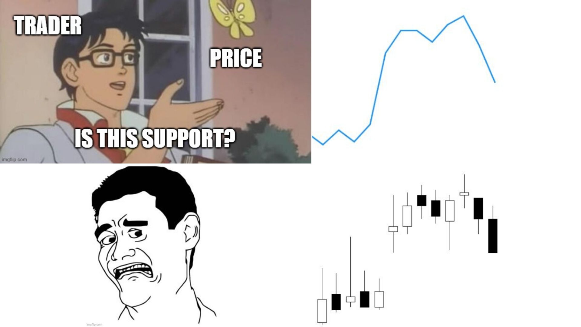
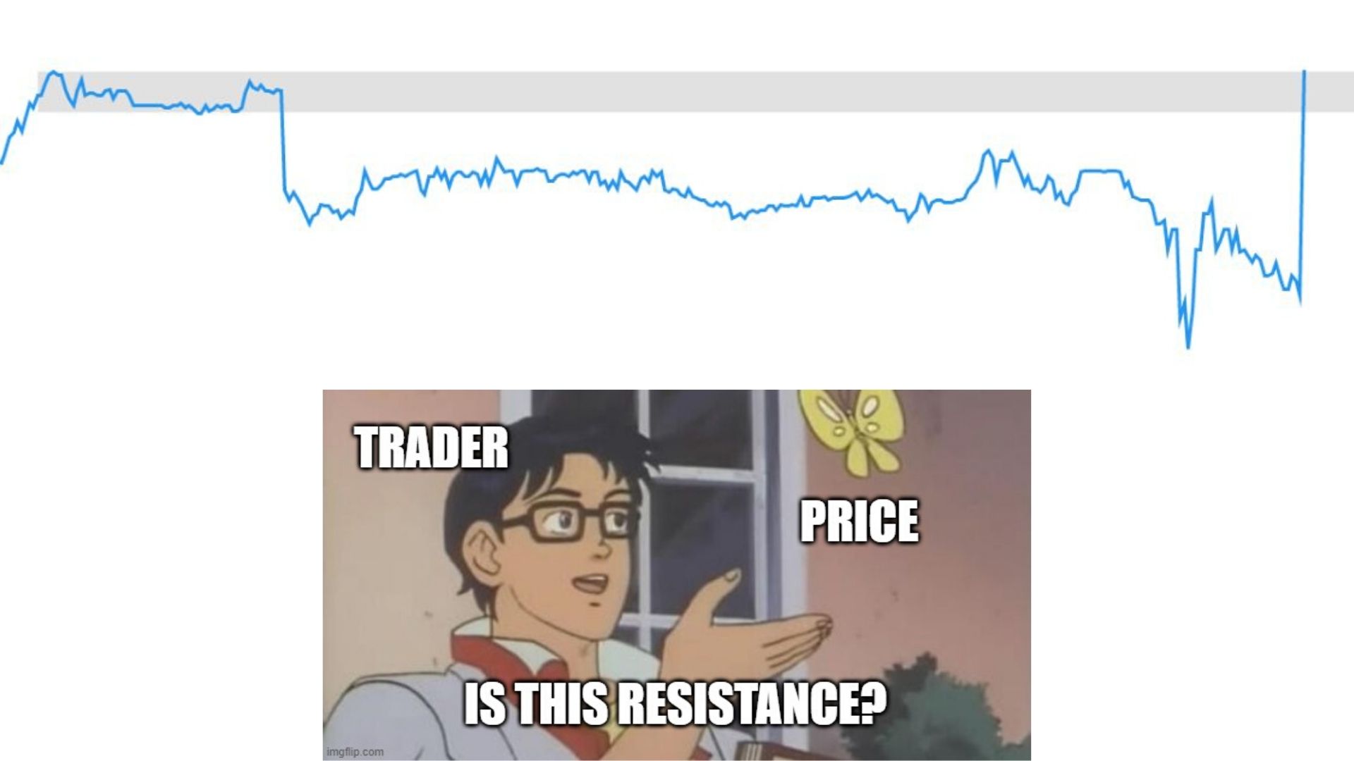
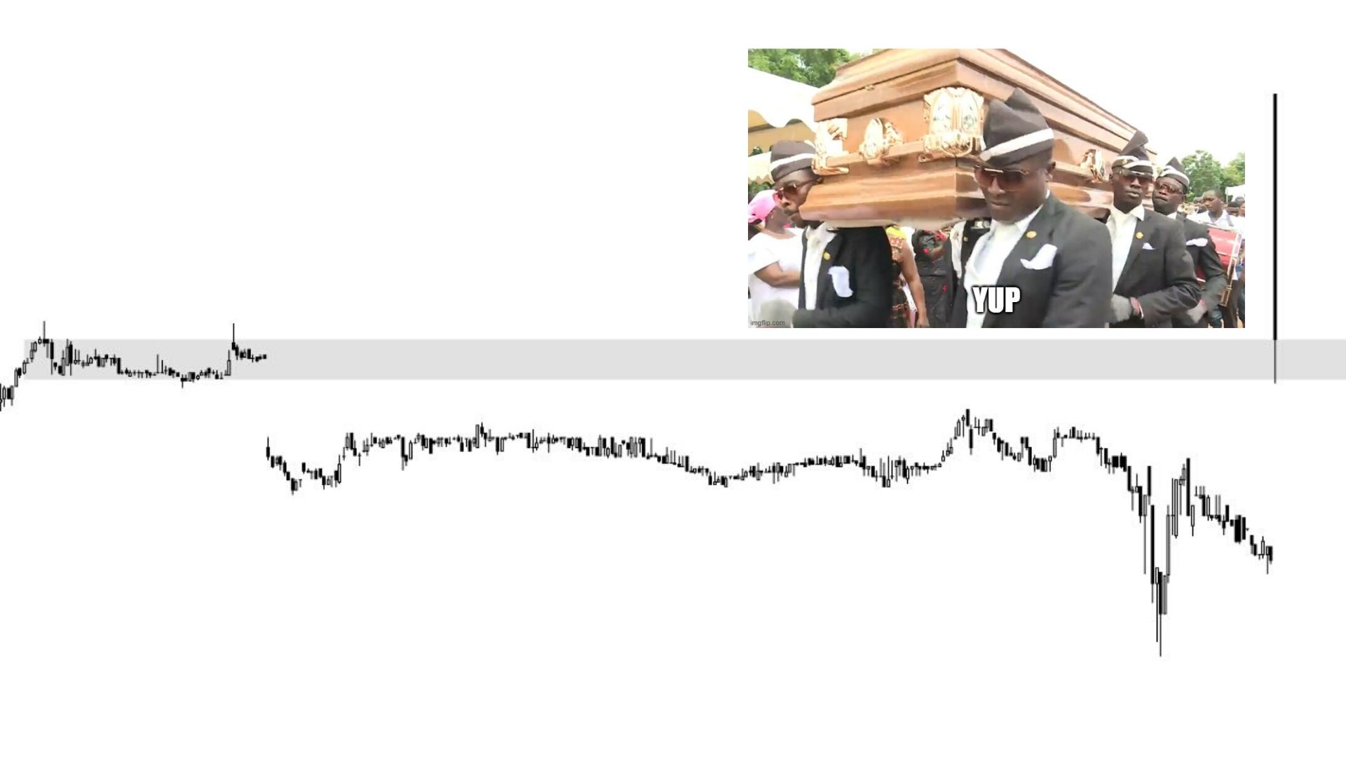
Clearer supports and resistances
The struggle I had during my early stages of trading was actually plotting supports and resistances. If you’ve been following me in the early stages of my trading journey, I used to utilize the Donchian Channels indicator to spot supports and resistances. So here’s an example of its usage with a period length of 10:
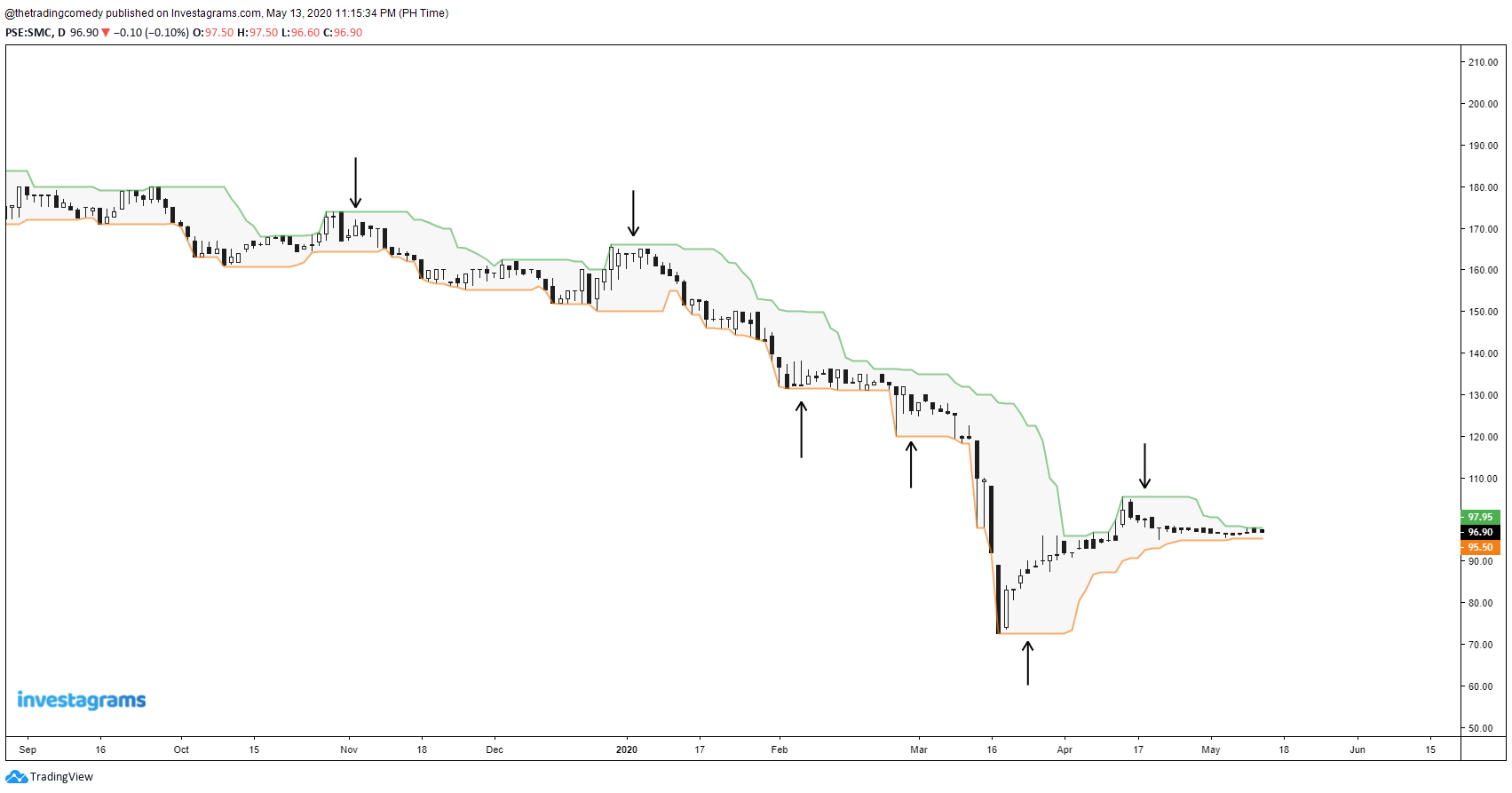
However, the problem with using this is that it might also give false levels causing you to create too many psychological levels inside your head.
Now let’s see when we view this chart using lines:
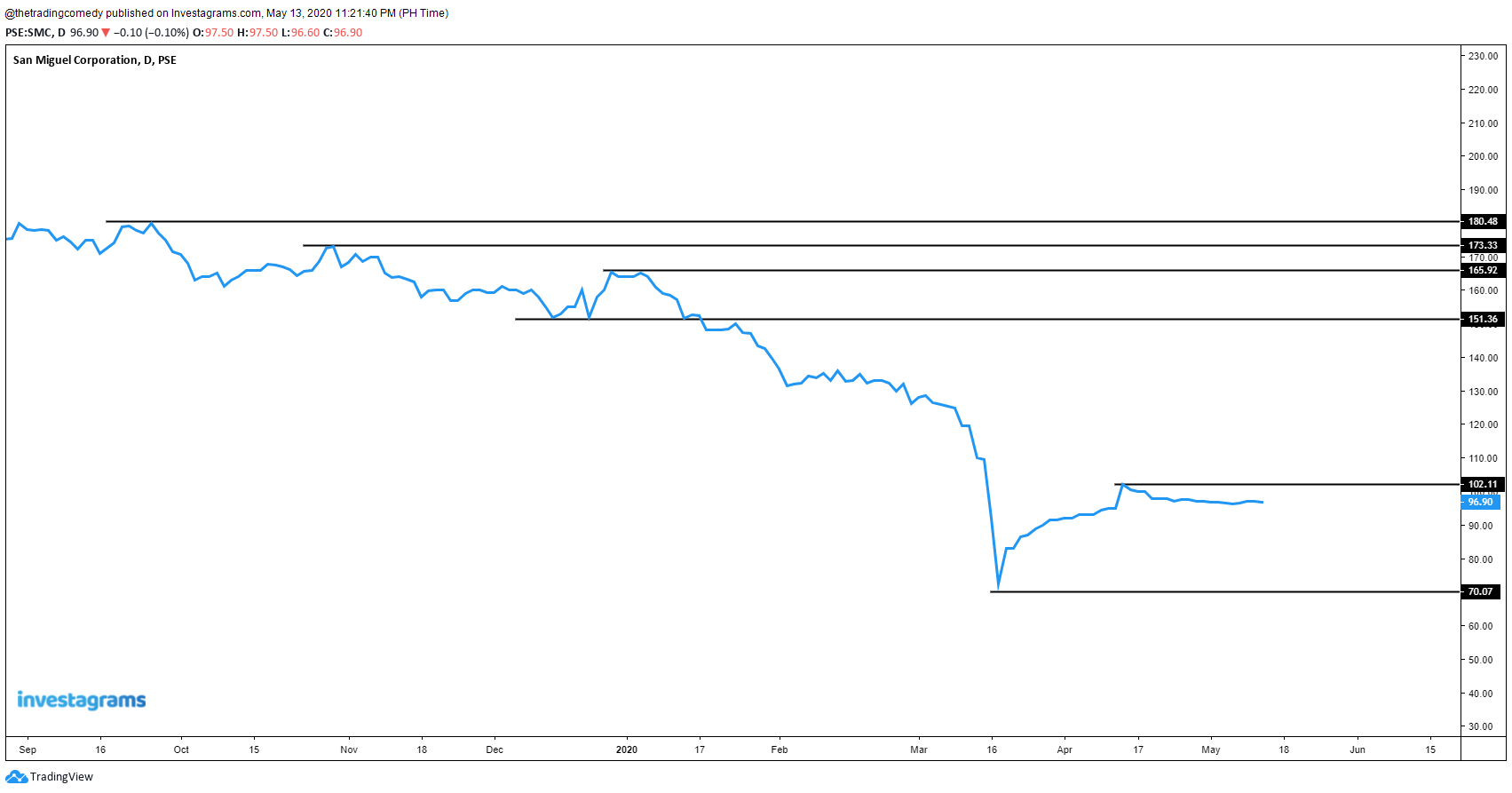
That’s better, and cleaner too!
Looking at the last examples will entirely depend on your visual preference. But with enough practice, you will get used to this.
It’s also easier to draw Fibonacci Retracements as well which brings us to the next advantage of using lines and MY NUMBER ONE REASON why I prefer using this view over candlesticks.
Lines can serve as your secret weapon for Elliott Waves
What are Elliott Waves? I’m not going to delve in too much on the topic since I know that there are contributors better than me who can explain more on detail but I will give you an idea on what it looks like just by looking at this illustration:
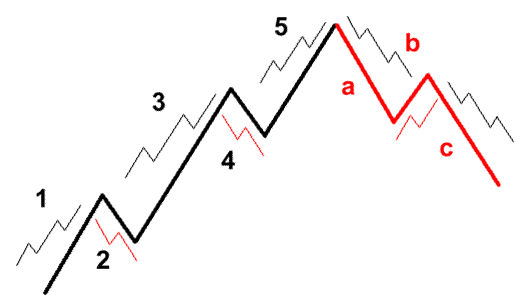
Source: babypips
Don’t get me wrong, I know a lot of awesome Elliotticians like Limitless Investor and Javi Medina who use candlestick charts on drawing Elliott Waves – and yes! I actually tried drawing those waves using the candlestick charts but guess what? It was a real headache for me!
In the brink of giving up on waves, a short conversation between me and Roy Lacsamana last InvestaSummit 2019 completely changed my approach to charts and it can be summarized in this statement:
“You should try Elliott Waves since you’re a musician, it suits you.”
And I can’t believe he was right! After weeks of figuring out why I was struggling, eventually, I found the reason why I was personally having a hard time understanding the waves – I was looking at the wrong view!
To put this into perspective, let’s reverse engineer an Elliottician’s chart from Limitless Investor, let’s say you have this example:
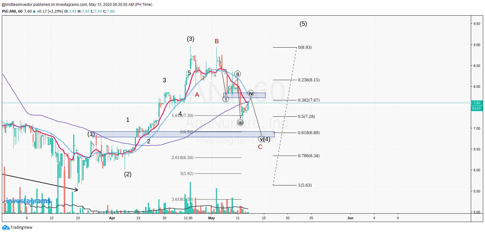
Since this is how I learned to understand Elliott Waves by reading other people’s charts, here is my perspective on his Elliott count using my custom retracement:
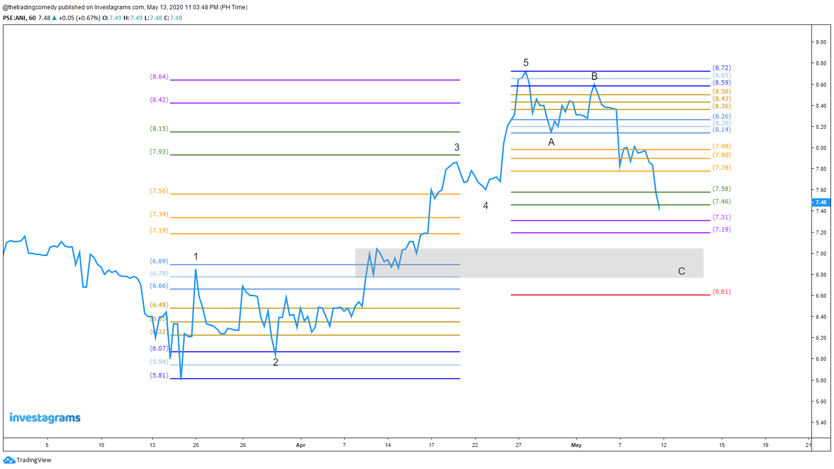
If you compare the two charts, it’s the same view – we’re just using different lenses.
Lines provide pure price action
So far I’ve only found both a pro and a con of using lines – it only gives the closing price. It sounds ironic when you think about it since the goal of the lines is to minimize the noise that you see in the charts, especially for those traders who started with candlestick charts.
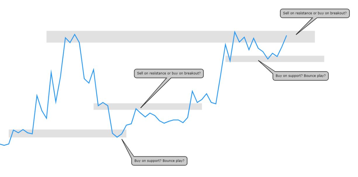
Bounce and breakout plays can somewhat frighten you as a trader if you rely purely on lines. One way to remedy this is to look at lower time frames to verify if an area is a support or resistance, but we’ll save that for another post.
Or you can just quickly switch to candlesticks and observe if the last candle shows signs of strength or weakness.
And yes, big and sharp moves created by lines can also give you hints of gaps when you switch to candlesticks.
If you are planning to transition to lines or a newbie and you feel like there’s still “something missing” in the charts, there’s actually an indicator that can help you deal with this problem and we will talk about it in the next section.
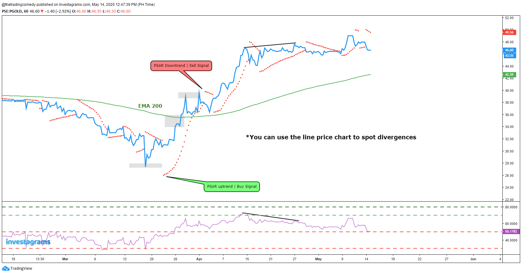
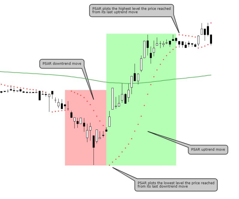
A Parabolic SAR can be your trusty sidekick as well as your “alternate candle high”
Have you ever got into a dilemma wherein you had a good entry but for some reason, you’ve created these psychological barriers that prevent you from holding or taking profits?
This is actually the reason why I got rid of A LOT of moving averages and stuck to only ONE moving average – the 200-period moving average.
The Parabolic SAR (Stop And Reverse/PSAR) can serve as an alternate indicator for the rest of the commonly used moving averages (20, 50, 100) and the signal is pretty straightforward to understand:
- When a dot is below the price, it’s an uptrend signal.
- When a dot is above the price, it’s a downtrend signal.
It’s a trend-following indicator in a way that you can use the first instance of the change of direction as an entry or exit signal. How is this an “alternate candle high” you may ask? We’ll make the charts do the talking:
Less is more
The candlestick is not the only view that you can utilize whenever you want to read price charts. There are other views that you can look at if candlesticks scare you. Sometimes the reason why you can’t execute your trades is maybe you have a lot of indicators that unconsciously give you noise.
In order to understand what view will suit you in your trading, you should discover what you’re visually comfortable with especially if you’re in it for the long road.
Anything is an opportunity, you just have to know where to look!
Now go out there and backtest to find out what trading style suits you and stay tuned for the next posts!
Contributor:
Name: Marvin Alec Padua
Investagrams Username: @thetradingcomedy
Channels:
www.facebook.com/thetradingcomedy
www.twitter.com/alecscorner
www.instagram.com/thetradingcomedy
www.thetradingcomedy.finance.blog
https://tinyurl.com/AlexCornerSpotify
https://micky.com.au/author/apadua
About the Contributor:
A self-proclaimed “Lazy Elliottician”, Alec is a former mobile app developer turned independent singer-songwriter and busker, who goes by the stage name “Alex Corner”. He has a couple of songs on Spotify and other music digital platforms. A self-taught trader, he also created his own trader persona – “The Trading Comedy”, where he documents his trading journey in the Philippine Stock Market and beyond. He is currently a finance writer for Micky News as well as a casual gamer and streamer.