One of the most popular indicators to identify shifts or changes in trends or momentum is the Moving Average Convergence Divergence or most popularly known as the MACD (pronounced as “Mac-Dee” or spelled out by saying M – A – C – D).
MACD was developed by Gerald Appel during the late ‘70s. This indicator is also popular for its simplicity and versatility as it can be used to indicate changes, whether bullish or bearish, in trend or momentum.
How Does the MACD Calculate its Own Movement?
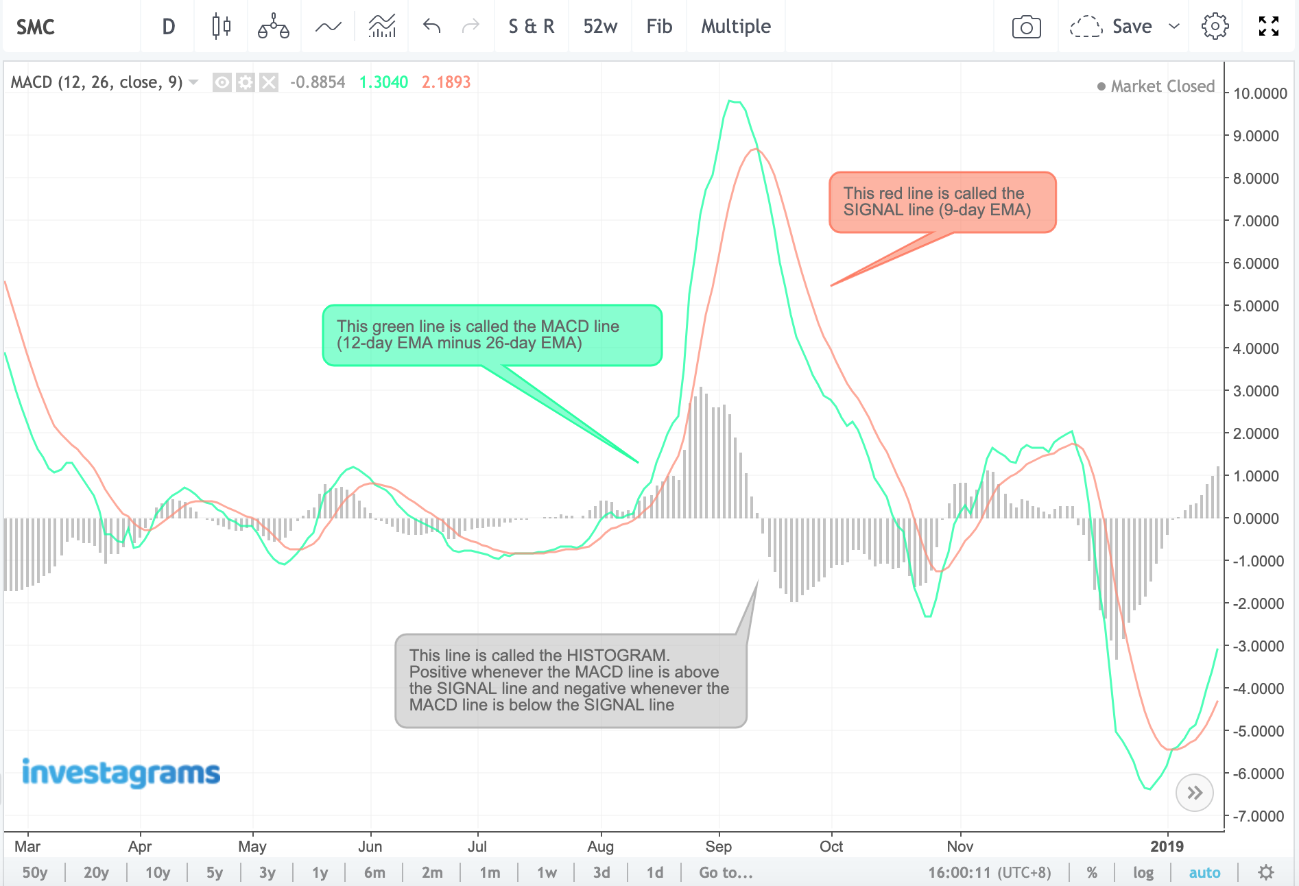
The standard settings for the MACD are the values 12, 26, and 9. These numbers are all Exponential Moving Average (EMA) which reacts faster than Simple Moving Averages (MA). A quick refresher, moving averages, be it simple or exponential, are both derived from the price action of a stock by computing the average price over a number of days or periods.
There are two lines in the MACD. The first line is calculated by subtracting the 12-day EMA by the 26-day EMA, the difference is then called the MACD Line. This moves faster than the other line. The 9-day EMA is left as is and is called the Signal Line. This is the slower moving line.
Another part of the MACD is called the Histogram. The MACD Histogram is responsible for demonstrating the difference of the MACD Line and the Signal Line. Whenever the MACD Line is above the Signal line, the Histogram will be positive (above the 0 line or the center line). When the Histogram is negative (below the 0 line or the center line), the MACD Line can be seen below the Signal Line.
Convergence and Divergence
A convergence means the faster moving average, the MACD Line, is nearing to meet with the slower moving average (Signal Line). A divergence, however, occurs when the MACD Line is distancing itself away from the Signal Line.
Parts of the Moving Average Convergence Divergence
What are the strategies we can use in the MACD?
The following are the strategies a trader utilizes the MACD for:
- Signal line crossovers
- Zero-line crossovers
- Divergences
- Histogram (Peak-through and slant divergences)
Signal Line Crossovers
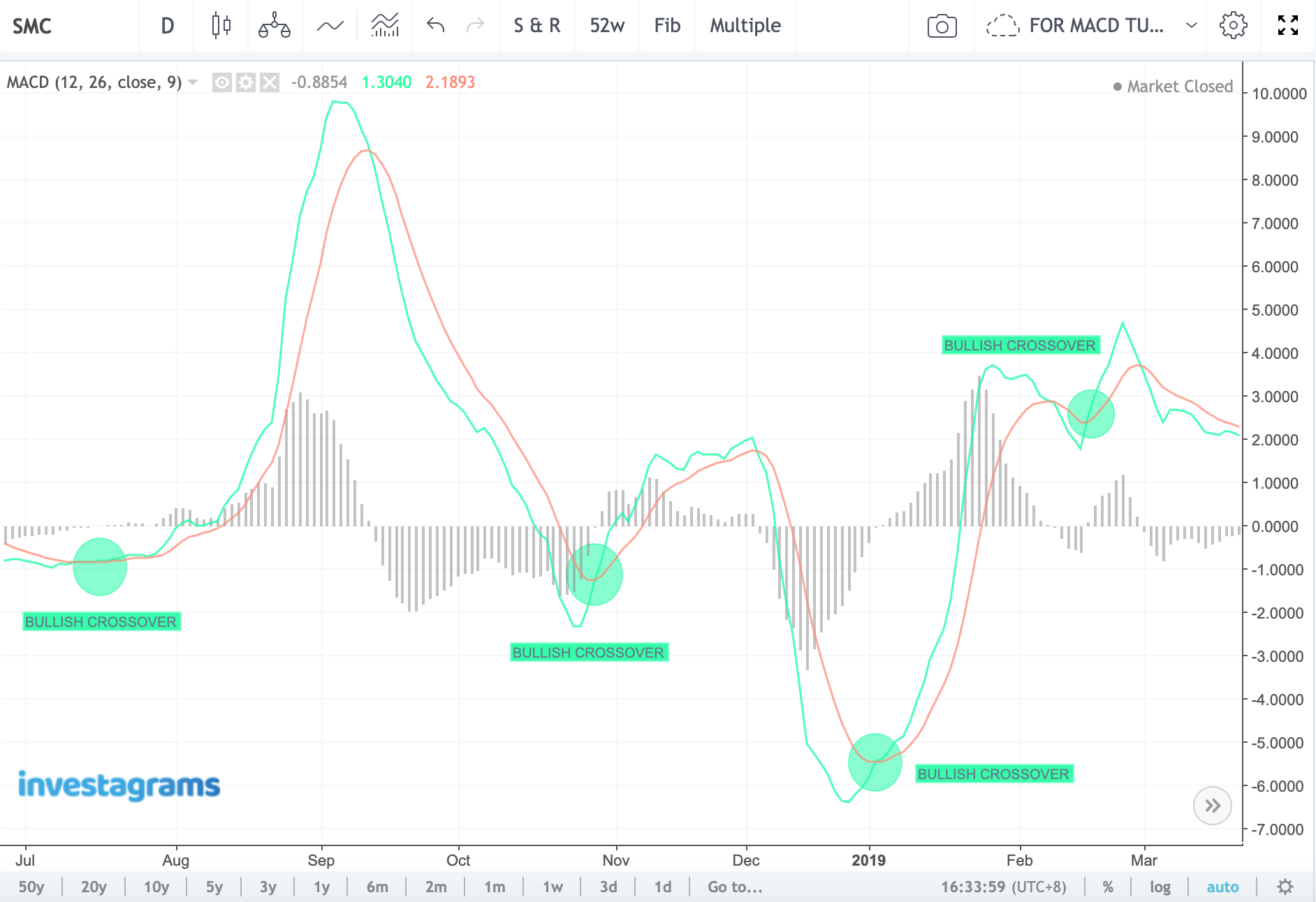
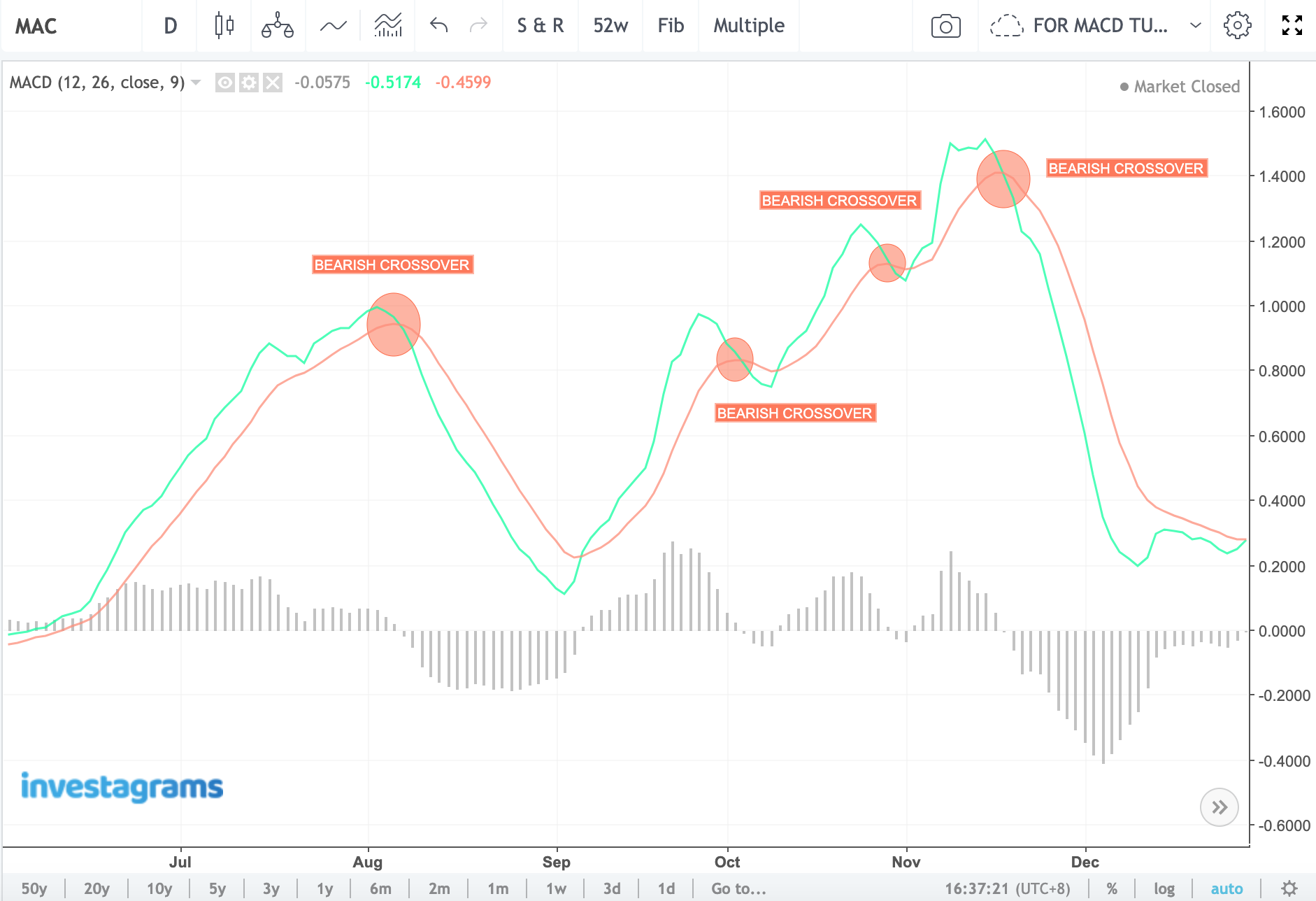
There are two types of signal line crossovers, the bullish crossover and the bearish crossover. These crossovers are used to know whenever there’s a shift from a trend or momentum. A bullish crossover happens when the MACD Line crosses above the Signal Line. A bearish crossover appears when the MACD Line crosses below the Signal Line.
Here’s an example of a bullish crossover:
Below is an example of a bearish crossover:
How to Use Signal Line Crossovers to Enter and Exit Your Positions?
This is where the MACD is most popularly used for. As the following examples would show, the MACD is highly effective in generating potential buy and sell signals.
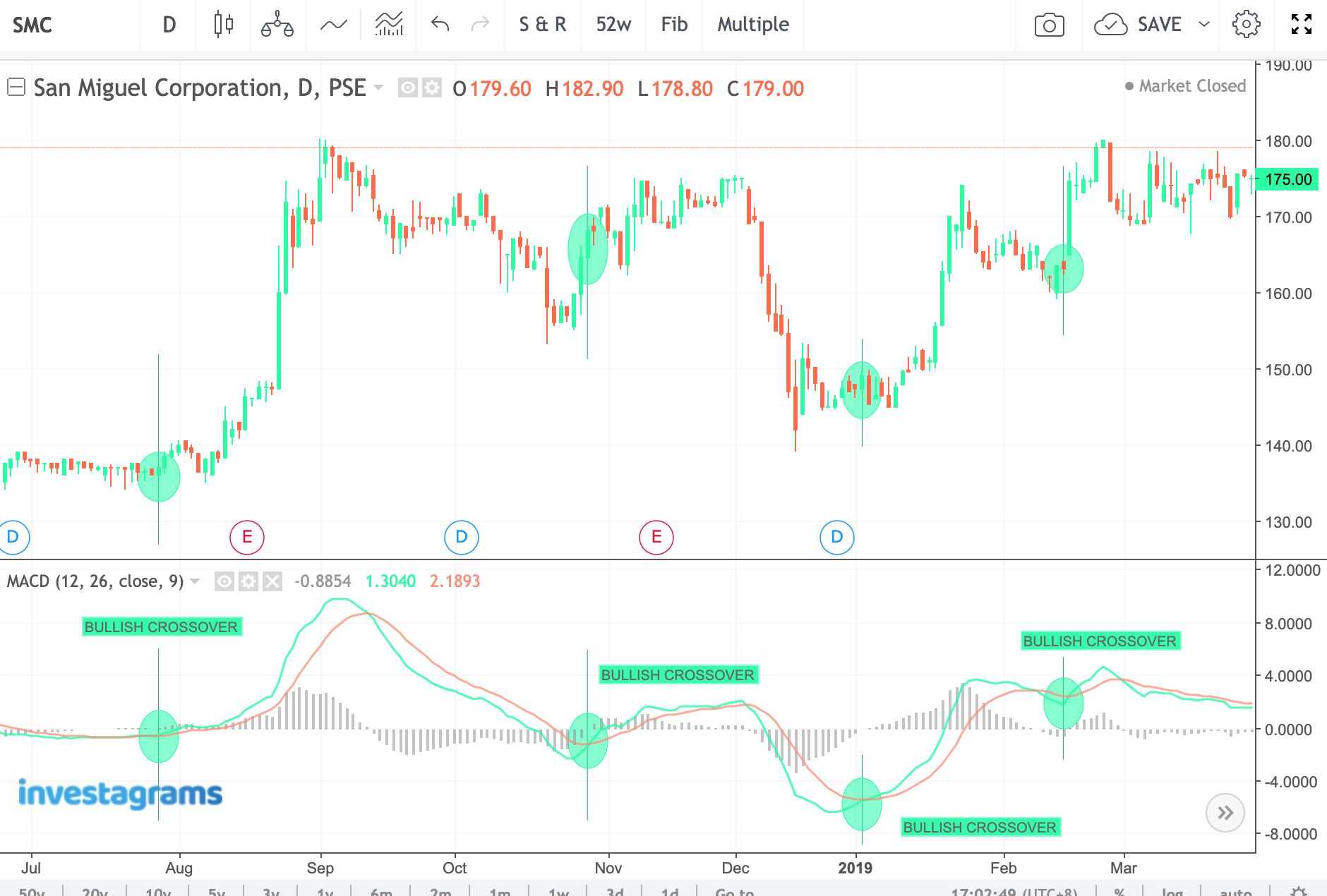
In the image below for $SMC (San Miguel Corporation), we can see how the 1st and 3rd bullish crossovers effectively signaled the start of the bullish momentum for $SMC.
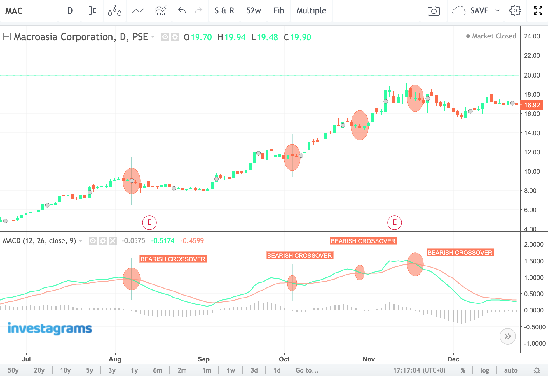
We can see bearish crossover sell signals in action for $MAC (MacroAsia Corporation). Although the signals don’t necessarily indicate the end of the uptrend, they could be used to take profit or trim down in your positions.
Zero-Line Crossovers
The zero-line crossover of the MACD can also be used to confirm changes in momentum and emergence of new trends. This crossover happens when the MACD Line crosses below or above the 0 line of the MACD.
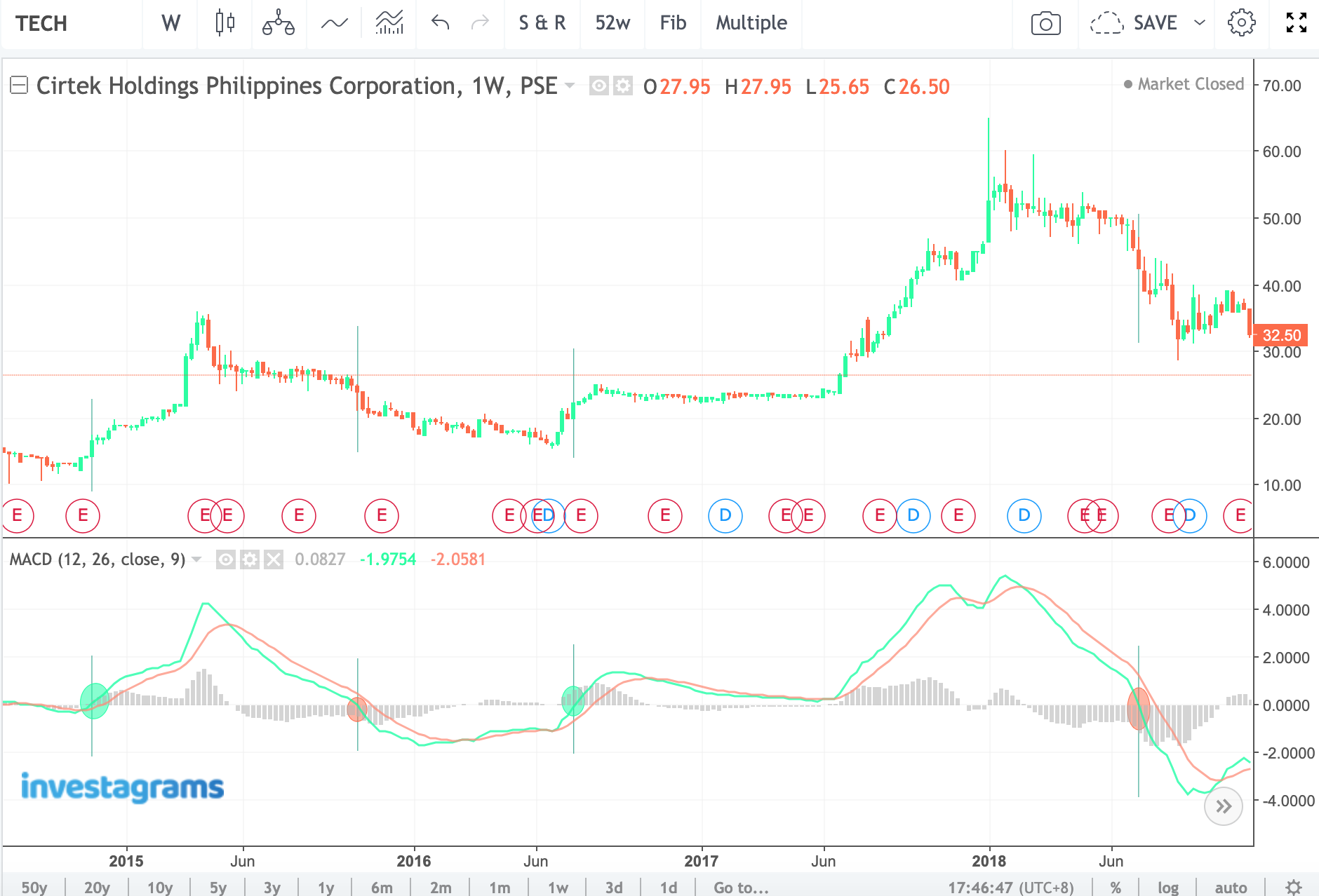
The MACD Line is the green line below. We can see how effective it was in generating momentum signals for $TECH (Cirtek Holdings Philippines Corporation). A possible buy signal could have been generated whenever the green line (MACD Line) crosses above the 0 line and a possible sell signal could have been implied whenever the MACD Line crosses below it. Keep in mind that you don’t need to use the MACD’s Histogram in this strategy.
Bullish and Bearish Divergences
Like the RSI and other momentum indicators, the MACD could be used to spot bullish and bearish divergences.
A bullish divergence happens when the MACD creates higher highs whilst the price action or the candlesticks make a lower highs. This indicates that there could be a bullish reversal within the stock.
A bearish divergence is just the reverse of it. It happens when the MACD creates a lower highs but the price action makes a higher highs, indicating a weakening bullish momentum.
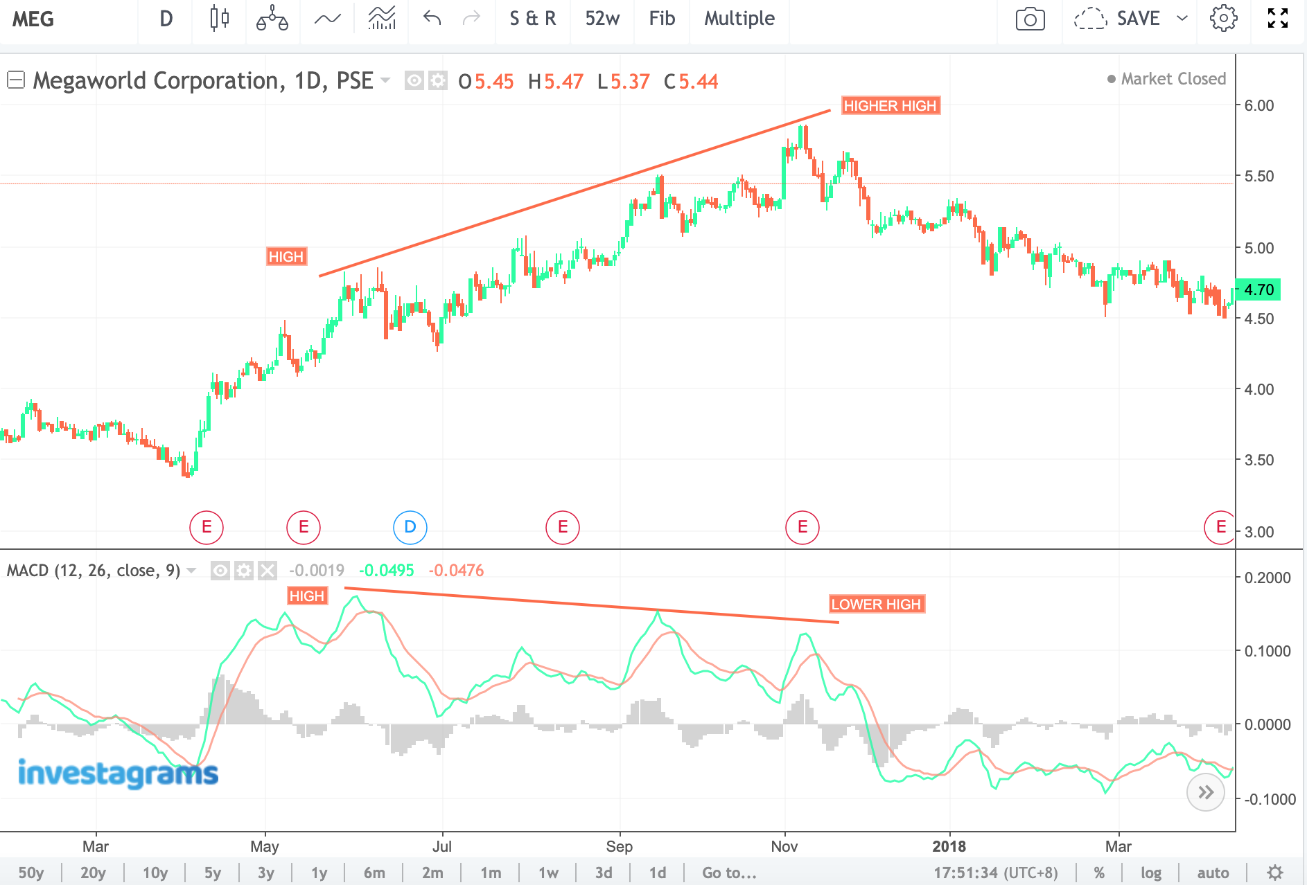
Here’s an example of a bearish divergence. $MEG (Megaworld Corporation) created a higher high but the MACD created a lower high. If you would notice in the right part of the chart, selling momentum overwhelmed buying. The MACD also went into the negative region.
The image below for $GLO (Globe Telecom, Inc.) is the bullish divergence, opposite of the bearish divergence. We can see how the stock reacted days after the bullish divergence was spotted. The MACD indicated that the selling pressure was waning down and that there was an impending bullish sentiment about to happen.
Histogram Strategies
The Histogram can also be used to foretell divergences or changes in the trend or momentum of a stock. There are two divergence strategies that can be used from the Histogram: Peak-Through and Slant Divergences.
Peak-Through Divergences
These are formed when the Histogram creates “peaks” (highs or lows) that diverge from what highs or lows the price action creates and later crosses over or goes “through” the 0 line. They can be either be bullish or bearish Peak-through divergences.
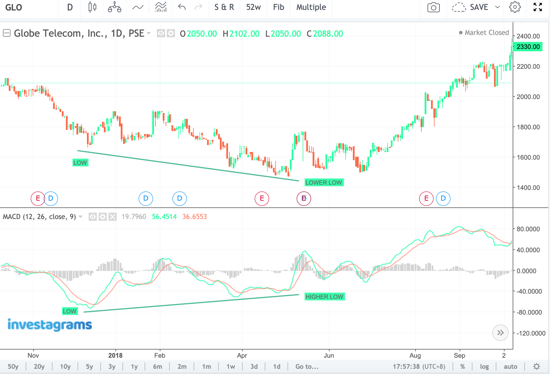
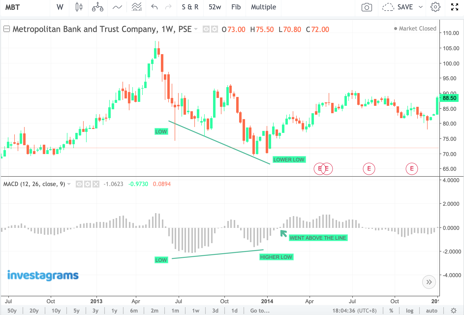
Here’s an example of a Peak-through bullish divergence in $MBT (Metropolitan Bank & Trust Company). The MACD Line and the Signal Line was removed here to highlight the peaks of the Histogram.
As you can see below, after $MBT made a lower low, the MACD Histogram signaled that the selling momentum was weakening by creating a higher low peak followed by going through the 0 line. The stock went on to create a higher low in price as seen on the right part of the chart.
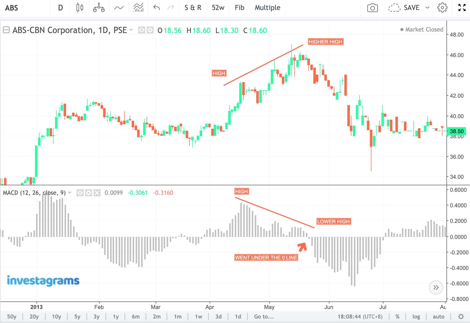
Bearish Peak-through divergences are just the inverse of its bullish counterpart. We can see how there was an impending sell off days after $ABS (ABS-CBN Corporation) created a higher high in the chart below.
Slant Divergences
These are simply slants that do not need mountain-like peaks that peak-throughs have. The Histogram should slowly display lower lines as it moves towards the 0 line to signal a possible shift in trend or momentum. The Histogram expands when the MACD Line noticeably moves away from the signal line, indicating a strengthening trend or momentum. The inverse happens when the MACD Line moves closer towards the Signal Line.
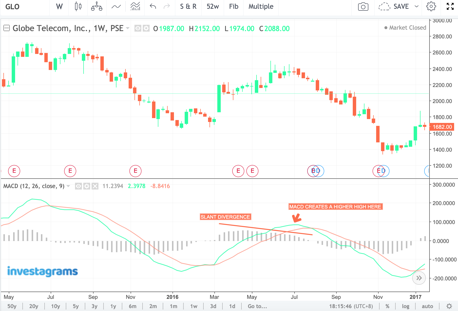
Below is an example of a bearish slant divergence for $GLO. We can see how the Histogram signified that the short rising momentum was short-lived and that it was forecasting a looming downward momentum. The Histogram displayed lower lines as the MACD created a higher high. Also, it generated the divergence even before the MACD created a bearish crossover.
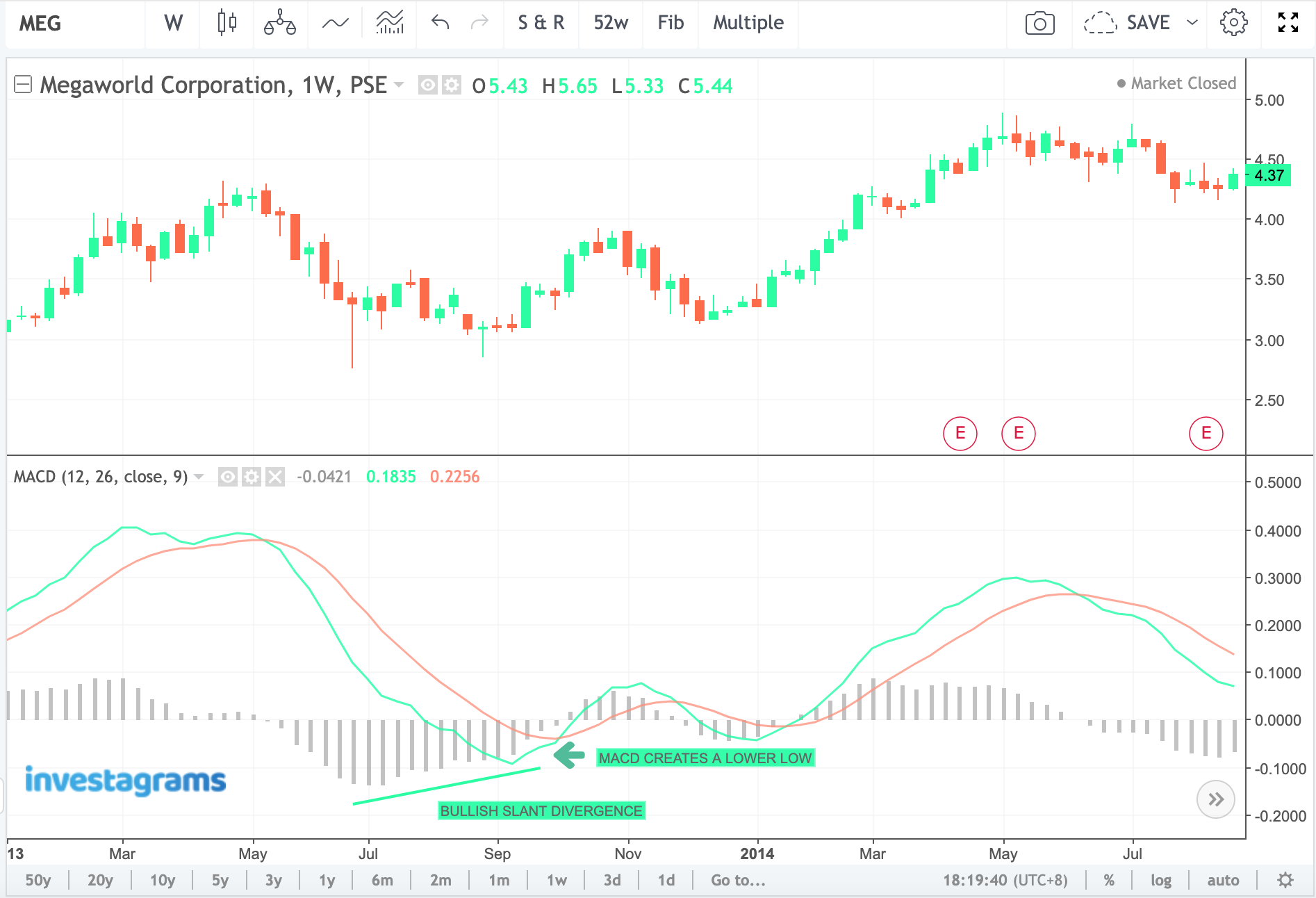
A bullish slant divergence can be seen in the chart of $MEG (Megaworld Corporation) below. It indicated a possible shift from selling pressure into buying pressure as the MACD established a lower low (even earlier than the bullish crossover that transpired).
Final Thoughts on MACD
The MACD is a reliable technical indicator that beginners can use in the Philippine Stock Exchange and other kinds of markets. The best way to use the MACD is when the stock is trending. A non-trending (moving sideways) stock is susceptible to false or even pre-mature signals that the MACD generates. Divergences that take place during a short-period are less effective compared to divergences that took a longer period to generate a possible buy or sell signal.
Continuously back-test the MACD if you want to integrate it in your approach in the market. The MACD does not guarantee you gains in the market. Like any other indicator, it only adds probability in your trading bias.
Happy back-testing!